How to incorporate the ceiling into your room design
I've been talking a bit about painted ceilings over on Instagram the last couple of weeks after including a pink ceiling in one of my client's projects and having the decorator refuse to paint it as it was just too outlandish for him! Designing a room with a colourful ceiling can be a fun and creative way to add visual interest and personality to your interior. Here are some steps to follow to help you include the ceiling with some examples of how designers have gone about it.
Designer Marta Ferri’s own Milanese home features this bespoke ceiling fresco by PICTA LAB
colour scheme
Firstly choose your colour scheme: Select a colour palette that will complement the rest of your home's decor. You can go for bright, bold colours or softer, more muted tones. Anything goes but it's important for the general aesthetic and feel of your home that the rooms speak to each other on some level, as when you are moving through your house there is a visual link with colour and feel. Consider the mood and atmosphere you want to create in the specific room.
Designer Jean Stoffer has loads of great example of how to incorporate bold colours into neutral schemes
Effect
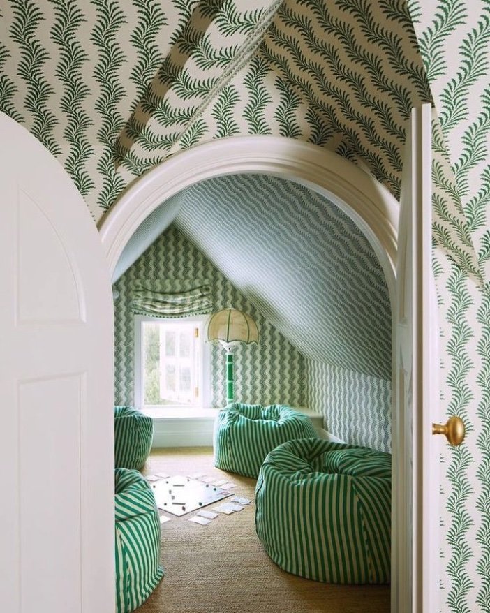
Decide on the type of ceiling, either the one you have already or an effect you would like to create. For example, for a very high ceiling consider painting the ceiling a darker tone and bringing it down to picture rail height to lower the feeling of the ceiling, like the example above. This can make the room feel cosier and more intimate. It's also a good way to add a bolder tone without putting it on the walls if you prefer a neutral palette. If you are decorating an attic room or one with lots of eves it is an idea to wrap colour or pattern over the whole space, seen below. Contrary to what people may think this unites the space and can actually help make it feel bigger, as there is less attention drawn to lots of ceiling planes which might otherwise be white - having white ceilings start below eye level brings the room down and makes it feel smaller.
Mark D. Sikes uses wallpaper to wrap an attic room, featured in Veranda Magazine
Pattern
Once you’ve Chosen the colours you want to use in your whole room select a tone or shade of one of them and incorporate it onto the ceiling. Consider using a single colour or multiple colours in a pattern or design, like in this example below and the top example by Marta Ferri. The effect of the circus tent makes the room feel wider as the lines stretch out from the centre; it's also really fun and quirky for a kids room. Marta Ferri's bespoke mural creates the feeling of being outdoors under trees, the whole feel of the room is transformed. Notice to how the light fitting is perfectly suited to the theme of branches, trees and being outdoors. When lit the chandelier will produce dappled shadows adding to the effect.
Designer Mehr Niazi transformed her son’s bedroom with this circus themed ceiling as featured on Chrystorama.com
Using different finishes
You can add texture and depth to your ceiling by using different finishes. For example, you can use glossy paint to reflect light or matt paint for a more subtle look. You can also use metallic finishes or wallpaper to add texture and interest like in this room below. The light reflects into the room as it would by using mirrors but with a more subtle effect. This metallic ceiling adds glamour as well as creating an inviting atmosphere for dining in.
Chloe Warner’s San Fransisco House project features this stunning metallic ceiling
Lighting
Lighting is crucial when designing a colorful ceiling. Make sure you choose the right type of lighting to highlight the colors and create the desired ambiance. You can use spotlights or recessed lighting to draw attention to specific areas of the ceiling. Alternatively use a statement light to draw more attention to the ceiling, it is the fifth wall after all!
Coordinate
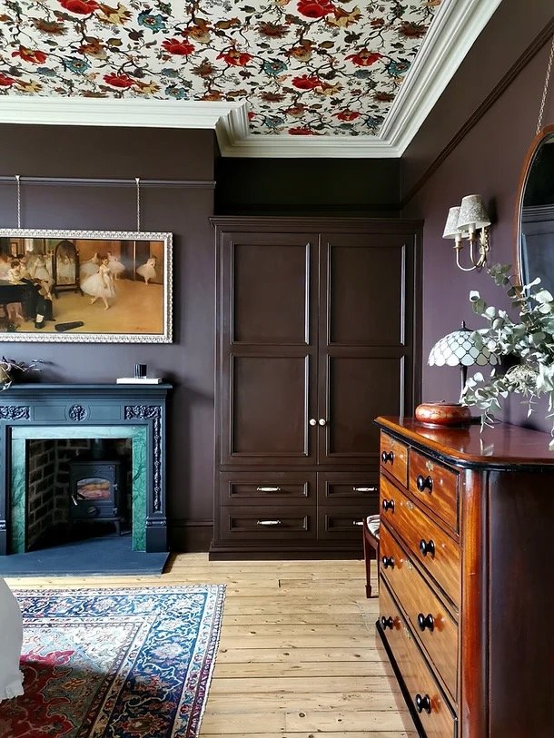
Your ceiling should complement the rest of your room's decor. Make sure the colors you choose work well with your furniture, wall colour, and accessories. In this traditional room below by Karen Knox the wallpaper has been used to add pattern but the style of the paper is traditional which ties in with the room's general aesthetic. Colours from the wallpaper have been taken and used on the ceiling moulding and on the walls. The accessory accent colours have also been taken from the wallpaper to add pops of colour here and there and this all helps create a cohesive scheme.
Karen Knox at Making spaces shows how to create a statement ceiling in her Ilkley Victorian Project
Zoning
I couldn't help share another of Karen Knox's designs here; as a really clever way to zone an open plan space. The orange wraps over the dining table creating a defined area within this room even although there are no walls. The lighting choice compliments it by following the profile of the painted area and lighting the whole table below. A colour like this bright orange would probably be too much for most people as orange can be overstimulating but as an accent it works really well. The colour has been brought down over the skirting too so that the eye isn’t drawn to a white line near the floor. So clever!
Another Making Spaces project showing how to zone a dining area using colour wrapping over the wall and ceiling
By following these steps, you can design a room with a considered ceiling that adds personality and visual interest to your interior. There are countless ways to do it whether you like bold or not. The main thing is that we start to consider the ceiling and don't just reach for the pure brilliant white without thinking it through. I'd love to know what you think, let me know in the comments or chat to me over on Instagram.


